The summers in Chico, California are increasingly hotter putting more and more strain on water supplies. That is why Lonely Oak Press focuses and specializes in landscaping and sustainable eco constructions promoting awareness and environmentally friendly solutions. Keeping this mind we designed their new branding identity with emphasis on a bold yet elegant design while staying mindful about the layout of content for the web design.


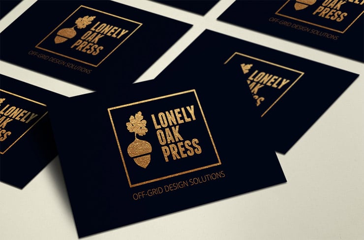
Working on the branding and logo we focused on finding the fine line between elegance and the bold aesthetics needed to convey the company’s strong stance on sustainability. We achieved this by using bold stacked typography, suitable for both gold foil print as well as simple black and white needs for merchandise and web design.
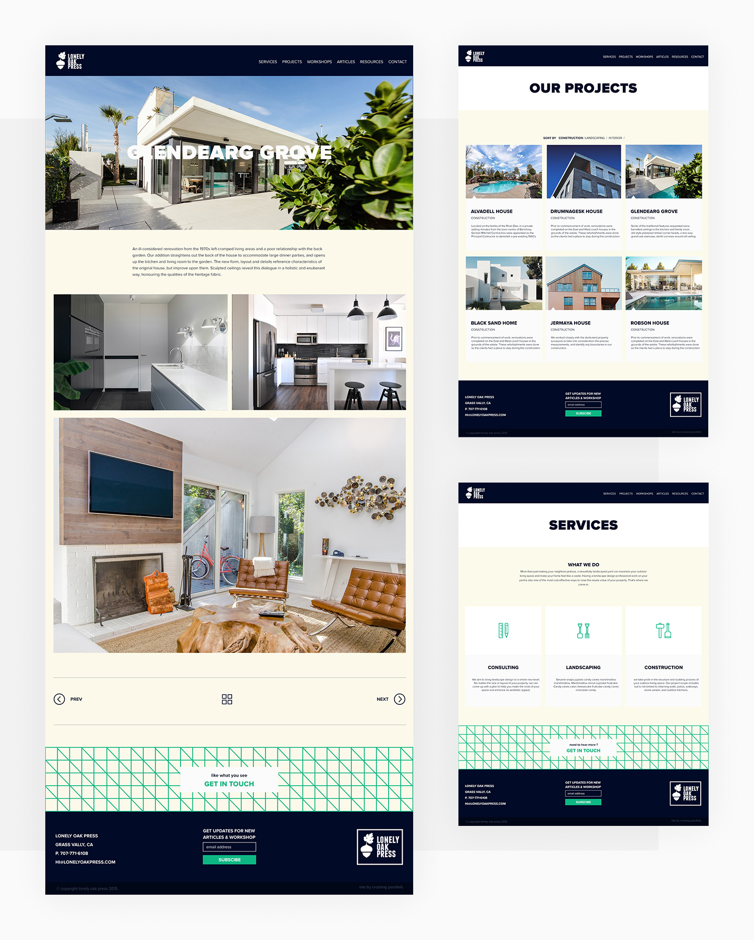
For the website we were inspired by the step by step, zig zagging nature of landscaping, carefully overlapping images and texts to simulate that phenomenon in gardening as well as building planning.


