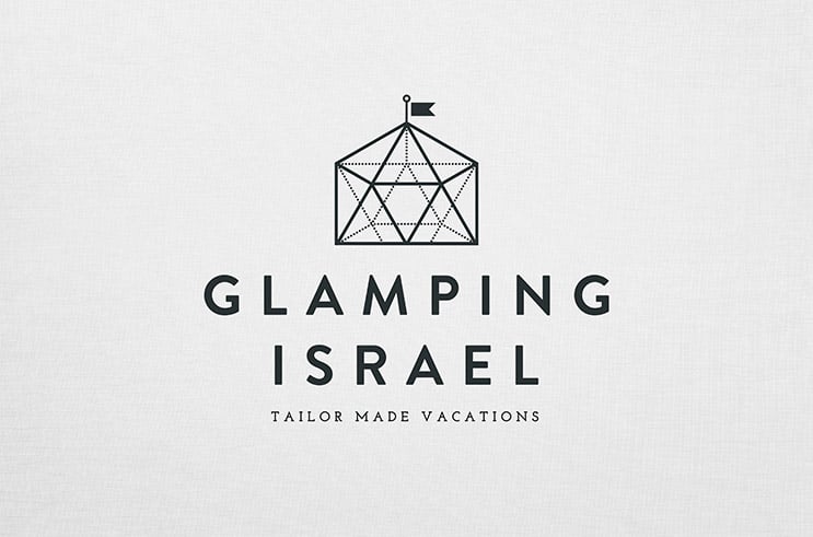
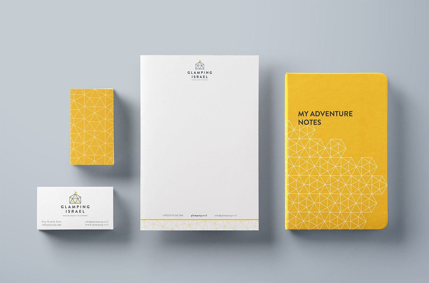
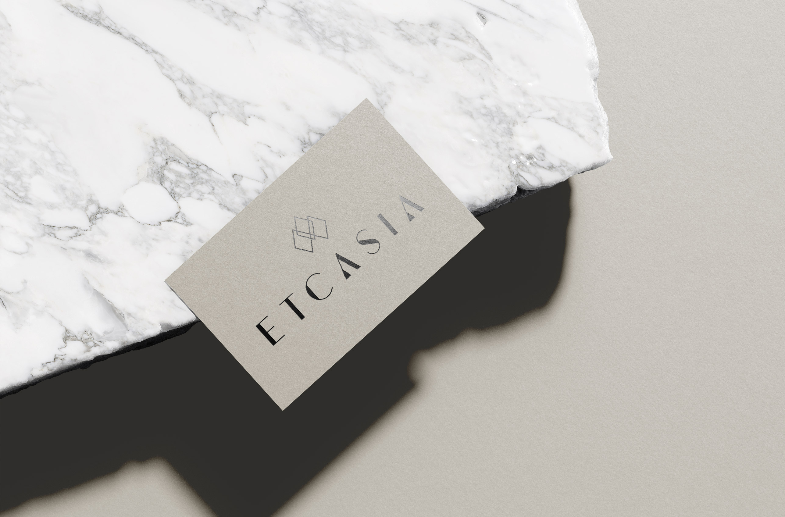
The logo takes its inspiration from the original glampers which historically were the royal European families. Keeping the distinct flag symbol we incorporated the triangular and geodesic shapes which are both literally representing one of their accommodation options as well as reflecting the modular and customizable nature of Glamping Israel. We also carefully tucked in a star of David to honour the geographical origin.
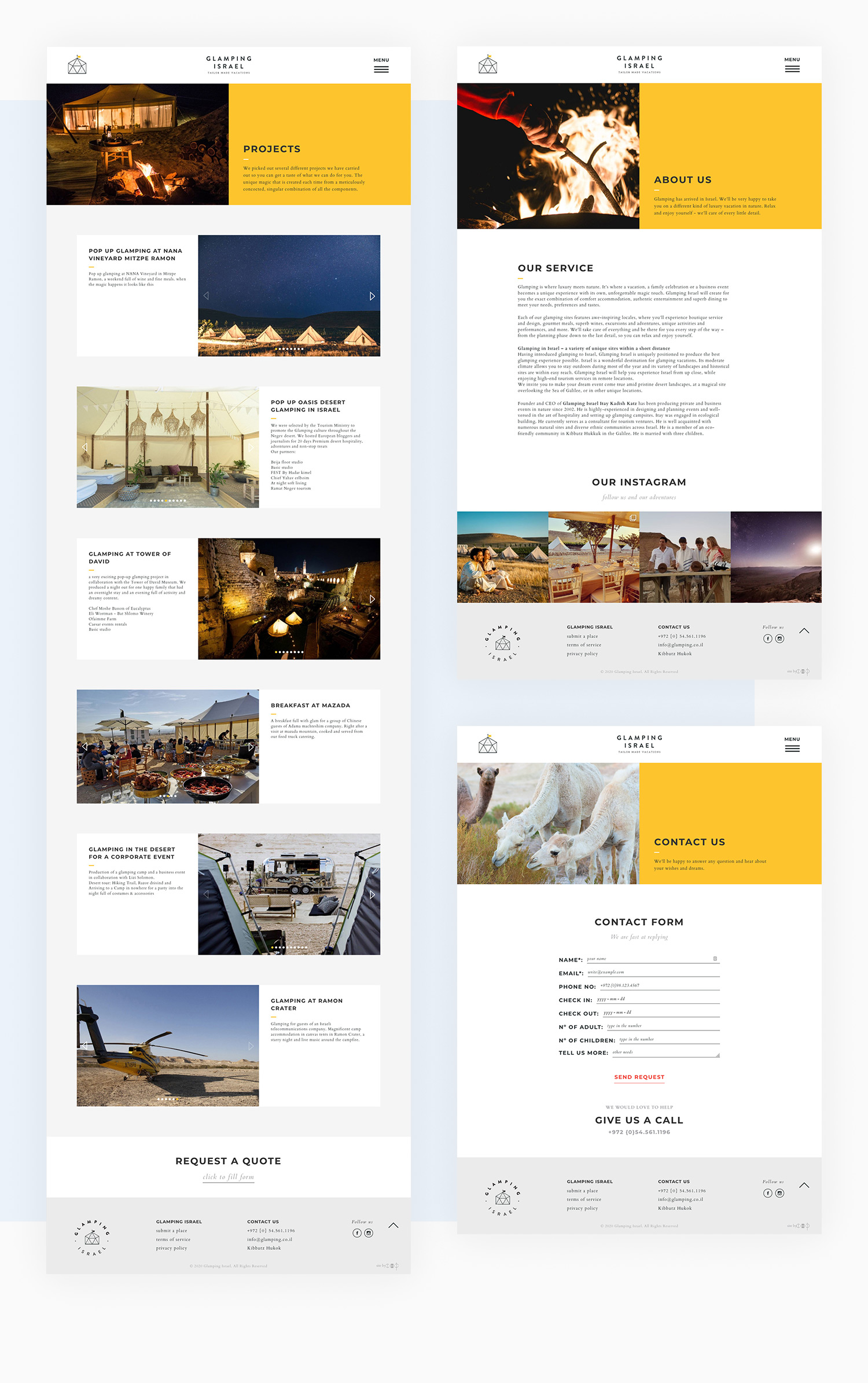
The digital experience needed to easily capture the clients’ attention and provoke an appetite for adventure while easily and quickly informing them about their options. Our approach was to maximize imagery use by simplifying the category process as well as creating big and bold categories.


