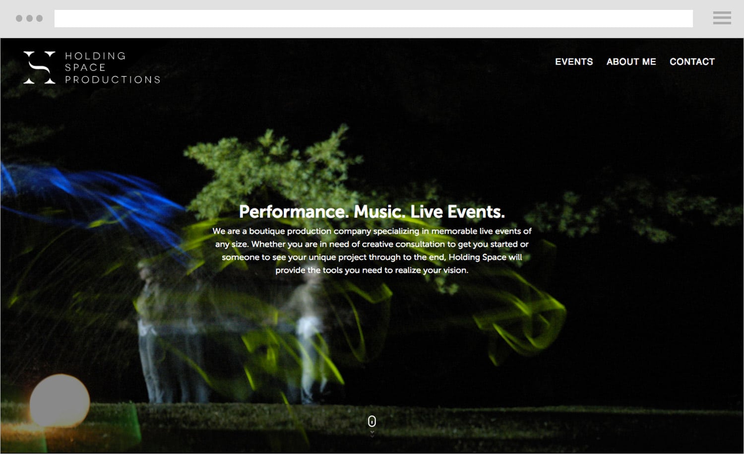
We designed the new brand identity & website for Vancouver based production company, Holding Space. Characterised by a laid back, creative West Coast attitude as well as an elegant & professional approach, Holding Space organizes a variety of events from interactive theatre shows, community engaging projects and art exhibitions. Working with the colloquial and regional root of their name, we created a branding identity that represents and holds space for creativity and community.
The result of our work is a strong design based on the letters H and S. The H became the pillars holding and hosting the (S)pace of community and creativity. The colours were specifically chosen to reflect the founder’s love of blue and coincidently his eye colour. The hue of the blue was carefully picked to give both prestige and uniqueness to the brand.
Maybe a new logo and a simple landing page is all you need? No matter your needs, fill up the form and we’ll be happy to help.