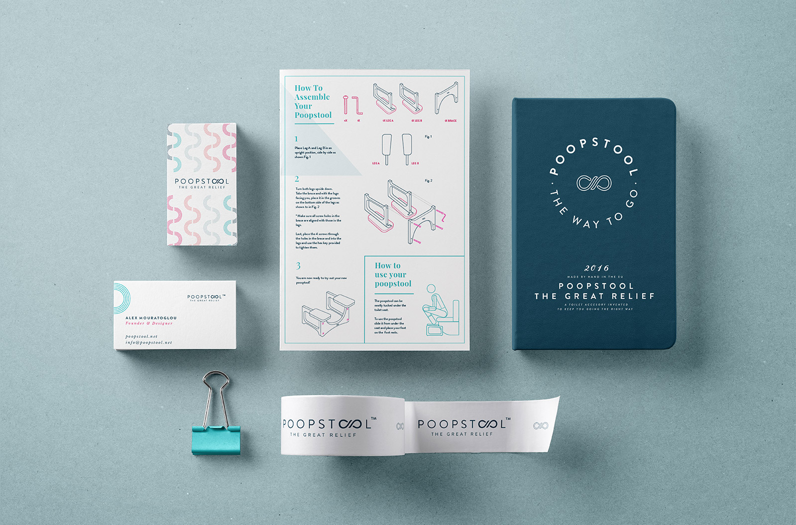
What is your first reaction to such a product name ? We believe ours was the same. Intrigued by both the ingenuity of the product as well as its name, we embarked on this visual journey of print and digital giggling along the way. How can you create a visual tone that approaches both the serious as well as the hilarious nature of this much needed toilet accessory? Our answer came through a well thought-out humorous yet educational content tone and artistic direction.
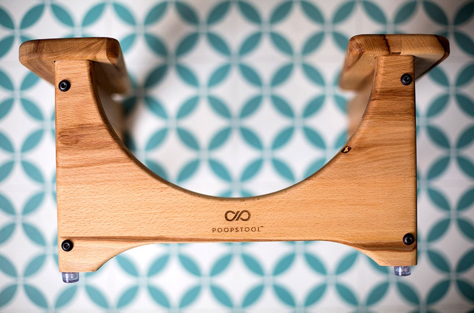
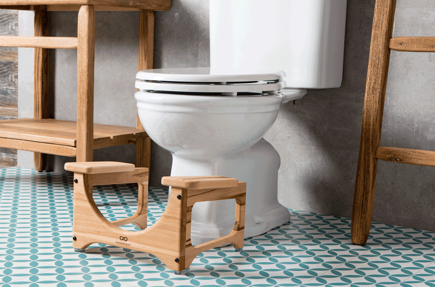
Based in Athens, Greece, Poopstool is a company that produces quality hand-made squatting stools for health and lifestyle purposes. Their good looking and qualitative design is what set them apart from the common plastic stool producers.
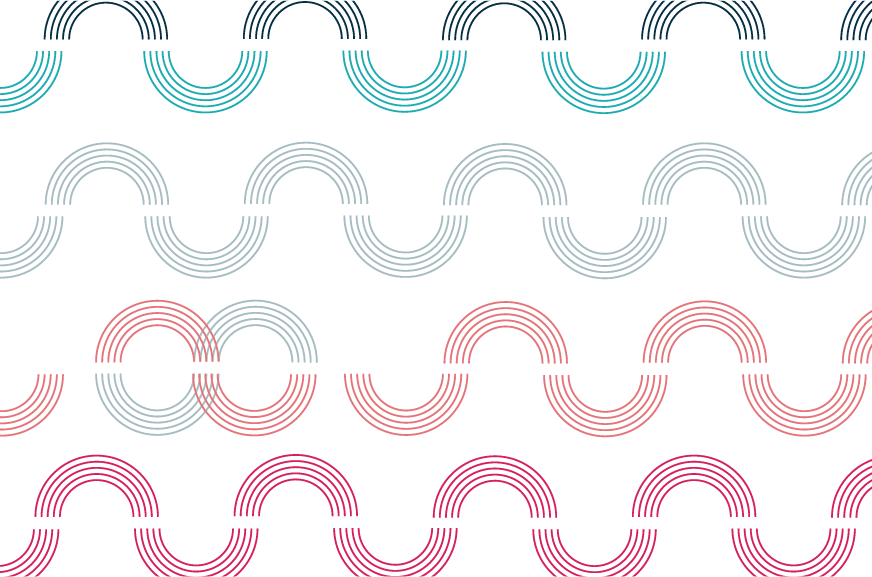
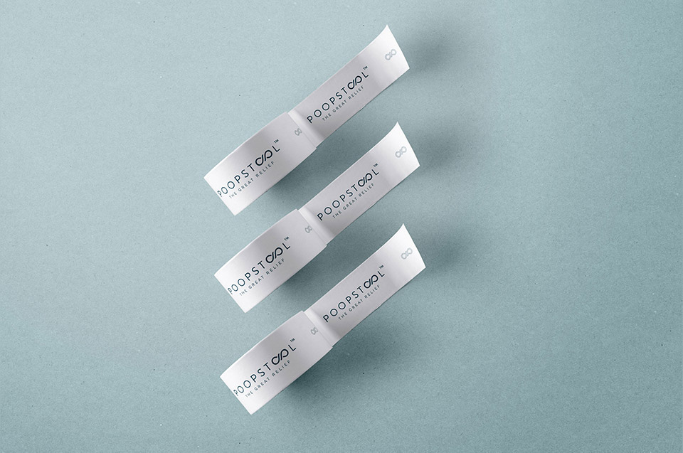
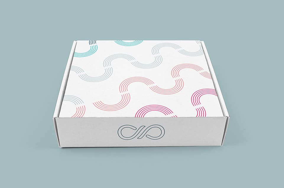
We knew we needed to approach the branding focused on the outcome of using this product: flow and relief.. Starting from the existing shape and design of the product we created a logo using its curved and flowing esthetics. We used bright, healthy colours, minimal flowing organic lines, combined to create an overall playful and distinct design. By carefully selecting the right visual tone we were able to reach a wider client audience.
The website design is a direct reflection of that playful flow of informative visual and written content.