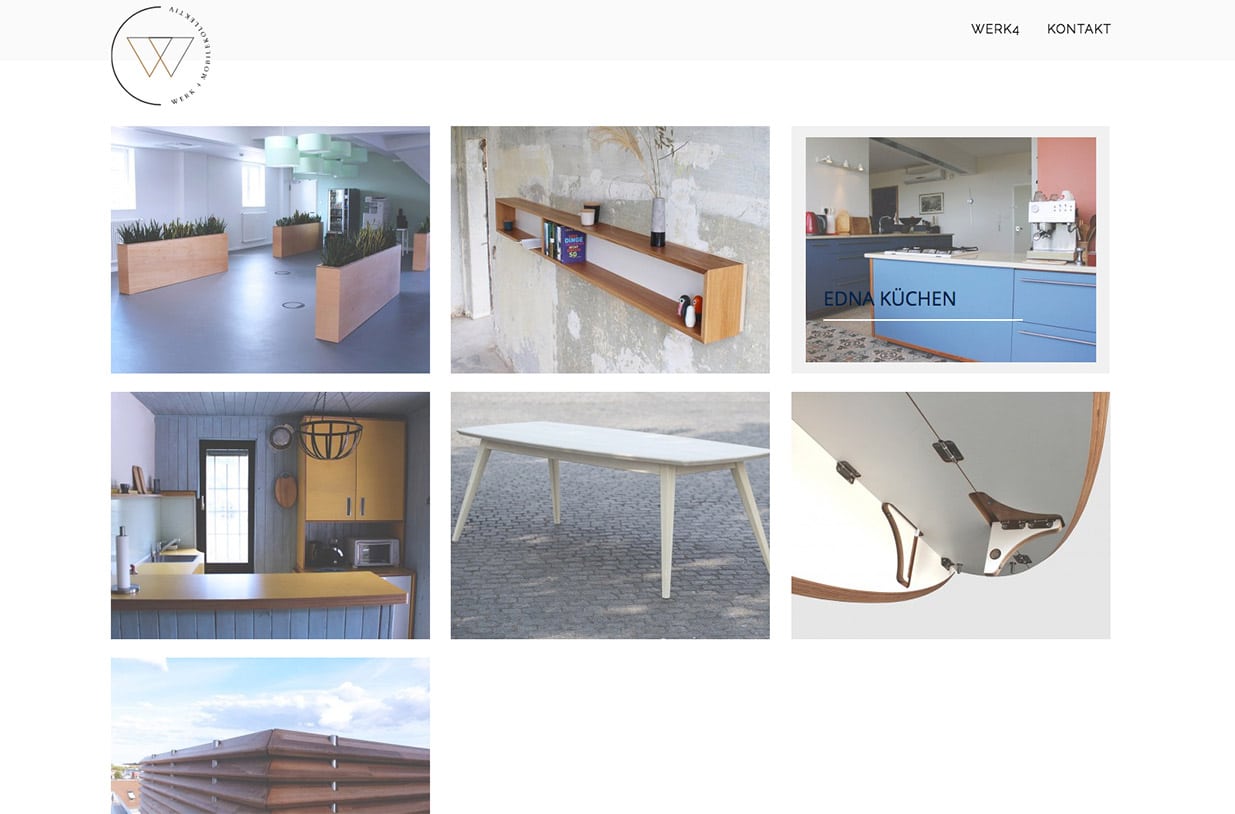
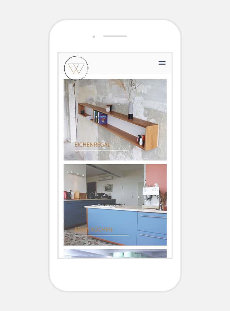
Berlin based custom cabinet makers WERK 4 approached us for creating a branding identity and website for their newly formed business. Having previous years of experience as cabinet makers, the 4 member company were looking to express and create a visual identity that captures their signature characteristics of clean and spacious design lines as well as complex and reliable German engineering.
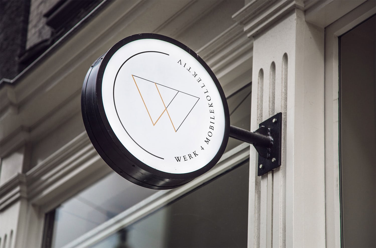
Our solution was to create a balanced visual play with contrast between new and old, using minimal letter forming shapes, traditional serif typography and spaciousness.
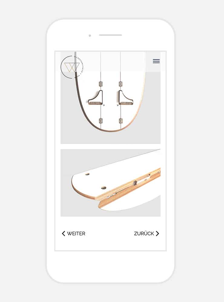
The website uses spacial relations to inspire prestige and contemporaneity, subtle photo filters to unify the overall look of their portfolio and finally smooth ux/ui transitions to complement the spacious experience.


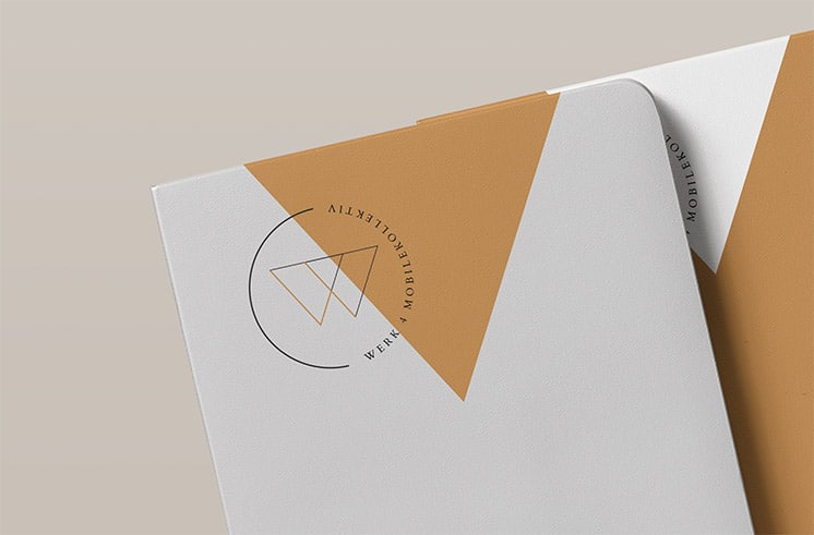
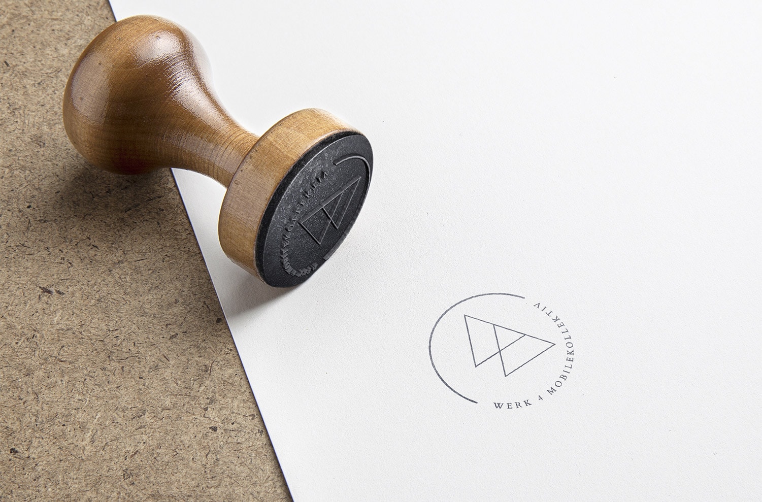
In the logo we explore the relationship between the letter W and number 4. We took the less obvious visual approach, subtly incorporating the number 4 in a wide angle W. Our final decision was to create a circular logo to reflect the friendly and approachable nature of this creative fourtet, giving a stamp and certified like look.
